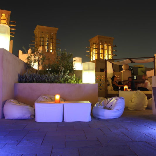
Every year, Pantone - a firm that works to standardise colours across the industry - announces its 'colour of the year'. Colour of the Year 2021 is Pantone 17-5104 Ultimate Gray + Pantone 13-0647 Illuminating - two independent colours that highlight how different elements come together to support one another. None of this is passing us by. Bean Bags R Us has been and will be, introducing these colours to our range of indoor and outdoor polyester bags both this year and next. Pantone Colour of the Year 2021 is awesome and perfectly captures the spirit of optimism and reflection as we move beyond the current crisis and back to life as normal.
How Pantone Revolutionised Colour Referencing For The Fabric Industry
For those outside the design world, colour referencing and systematisation seems like a minor procedural matter. However, for those embroiled in it, it is everything. Designers need standardisation to communicate their ideas with each other. That's where Pantone helps. In 1963, the company introduced the revolutionary Pantone Matching System (PMS). This provided codes that colour-conscious industries - such as textiles, interiors, beauty and industrial design - could use to reproduce designs consistently and accurately, anywhere in the world. The brand arranged colours according to a numbered code, encompassing more than 10,000 standards, covering the vast majority of production requirements. Manufacturers used Pantone's PMS for coatings to pigments, plastics, printing, fabrics and more. Before 1963, Pantone had a long history of manufacturing colour cards for cosmetics brands. The firm would print out colour examples and then suggest that firms use them as the reference standard. However, in the early 1960s, there was still no universal reference standard that companies could use for colours. It was all quite wishy-washy, based on specific names (such as 'bubblegum pink'). Employee Lawrence Herbert joined the firm in 1956. He noticed that this lack of accuracy was making it difficult for designers to talk about the colours that they actually wanted. For instance, what was the difference between a 'greeny-yellow' and a 'yellowy-green'? Colour issues meant that manufacturers often made mistakes, creating entire batches of products that didn't meet the original design specifications. It was particularly hard to judge the shade of a colour, and inefficiencies also emerged for cool and warmer tones.
Thank you Mr Herbert
Herbert saw that there was a better way to do things so, in 1962, he decided to buy out the company. A year later, he created one of the first colour-matching systems which he believed had the potential to become a worldwide standard. The numerical language would allow any printer to reproduce colours accurately without the need for guesswork. Shortly after, Pantone began printing blocks of colour on 6x2-inch pieces of cardboard and then binding them together in a small flipbook, showing groups of related shades. Typical flipbooks contained a range of greens with different luminescence. Manufacturers and printers could then use these as reference standards for their processes, checking that their colours were accurate. The impact of Herbert's new system on regular brands was tremendous. In the past, it was a common occurrence for consumers to arrive at a shelf full of products and for all the labels to be slightly different colours. For example, Daz washing powder boxes might be salmon one week and scarlet the next. Technically, both are shades of red, but they confuse consumers. Lack of consistency damages brand trust. Herbert was able to eliminate this problem by systematising thousands of colours along with standards that brands could easily reproduce. It meant that the Coca-Cola company could deliver customers the same shade of red bottles whether they were buying Coke in Bangkok or Berlin. All it needed to do was communicate Pantone colour information to all of its manufacturing facilities to harmonise worldwide production. Interestingly, Pantone wasn't the first colour-standard language. However, like the QWERTY keyboard, it quickly became fashionable. Eventually, people used it so widely that it became the default, and no other players in the industry could compete. Historians believe that Herbert's approach of distributing colour booklets worldwide secured Pantone’s success. Flogging them in the US, Europe and Asia at the same time helped to establish his global standard. The 1960s saw Pantone distribute tens of thousands of flipbooks to any manufacturers who would have them. By the 1970s, it was hundreds of thousands of books per year and, today, it is millions. Pantone is now the colour standard for industry across the globe, except in Japan.
Pantone Colour Systems
The aim of Pantone's 'Color System' is to provide a universal language of colour that enables businesses to make 'colour-critical decisions' with confidence. Interestingly, the company offers two systems: the Pantone Matching System (PMS) discussed above, and the Pantone Fashion, Home + Interiors (FHI) system. Creating two systems allowed Pantone to address the market-relevant needs of its audience. Packaging designers require brighter colours for making products pop off shelves (available in PMS) while interior designers need more neutrals, whites and blacks in their palette (something that FHI addresses). Colours also look slightly different when they appear on different materials. In some cases, colours are simply unavailable or impossible to create on specific substrates. Again, PMS and FHI cater to these idiosyncrasies. Pantone provides an in-depth guide to which system businesses should use. For graphics, it recommends PMS. PMS is good for print, packaging, digital marketing and screen printing. For textiles, it suggests FHI because it is ideal for soft goods, fabrics and apparel. For coatings and pigments, it again suggests FHI because it is great for leathers, paints, cosmetics and accessories.
Pantone Colour Of The Year 2021
While Pantone had tremendous success selling booklets, Herbert had the wisdom to see that the brands had to offer more than its colour matching system to be successful. Today, Pantone is famous for many other activities, including the Pantone Colour Institute, Pantone lipstick, and Pantone hotels. Each works in tandem with the other, reinforcing their mutual appeal. Pantone Colour of the Year is a major innovation on the part of the company thanks to the sheer level of publicity it creates. Through this vehicle, the brand has done the seemingly impossible and turned basic shades into fashion trends in their own right. Pantone Colour of the Year started more than twenty years ago. From 2000 onwards, Pantone scoured the globe for new colour trends that captured the spirit of the time. The selection process wasn't and isn't random, the brand says. Instead, it requires 'thoughtful consideration and trend analysis' encompassing the film and entertainment industry, fashion, technology, popular travel destinations, lifestyle and more. The firm's aim is to select colours that encapsulate the mood of the times and also look stunning at the same time. Socio-economic conditions can play a role.
Previous Years
In 2020, for instance, Pantone's colour of the year was Classic Blue 19-4052. It was a sombre colour, representing the impact of the pandemic on people's lives. The imagery that accompanied the blue featured two people, just out of arm's reach, reminiscent of social distancing. 2017 was another note-worthy year. During the height of the discussion on ocean plastic pollution, Pantone's colour of the year was Greenery 15-0343, reflecting a new collective commitment to preserving nature. There have been numerous other notable winning colours, including Radiant Orchid 18-3224 in 2014, Marsala 18-1438 in 2015 and Living Coral 16-1546 in 2019. Pantone's colour selection process is shrouded in secrecy. Every December, the firm invites representatives from national colour standards agencies across the world to meet at prestigious venues in European capitals. Attendees make presentations and then debate which colour they think would be best for the following year. They can take into consideration anything that is happening in popular culture. For many participants, it is an opportunity to find out what's going on in their language - design. They use Pantone Colour of the Year to assess the mood and share it with their stakeholders. The meeting is also an opportunity to build product plans for the following. Designers in the textile industry want to keep up with the latest trends so that they can provide consumers with the most relevant and up-to-the-minute products. The first Pantone Colour of the Year in 2000 was an exciting time. The Dotcom bubble was bursting and the stock market looked like it was going to take a tumble. People wanted something that added more substance to their lives, and Pantone's response was to add colour to the collective discussion.
Pantone Begins Consulting
Pantone soon realised that it could leverage its brand to offer colour consulting services. The majority of design-conscious firms were choosing colours based on the whims of their in-house design teams. They were not really thinking through the kinds of colours that would serve them best. The electronics industry was a case in point. For years, computer manufacturers churned out devices in variations of grey and beige. It was only when Apple released the iMac G3s in 1998 that things began to change. Pantone's 'Color Institute' first opened its doors in 1986. The new department would help brands find the best colours available for communicating their priorities. The company invested heavily in researching colour trends and selling forecasting books for $800 a pop to any company that would take them. Almost immediately, paying clients from industries as diverse as fashion and electronics began lining up, eagerly listening to what the brand had to say.
Pantone Institute
Today, companies that enlist the help of Pantone's Institute get a range of services. Every piece of advice is tailored and takes into consideration a brand's competition, where the brand sees itself in five years time, and which colours are likely to get them there. Consultants don't adopt a boilerplate approach. Instead, Pantone takes a holistic view of the process, tackling it at all angles. It walks in the shoes of its clients' audiences, asking what emotions specific tones evoke. The company's colour consulting services took off in the 2000s and now practically every major brand has brushed shoulders with the firm. Pantone has become like an oracle, answering companies most personal identity-related questions in a way that no other marketing or consulting agency can. Of course, none of this comes cheap. Pantone is well known for charging a fortune for its services - and that's if you can even get a foot in the door. Consulting time is so limited that the vast majority of brands wind up on long waiting lists, with many standing slim chances of ever getting real face time. Colour consulting is a big opportunity, though. Fortune 500 firms are becoming increasingly aware of the power that it has on consumer psychology. Getting the cycle right could lead to more sales, higher profits and a more desirable brand. It's a marker of differentiation that sets firms apart from their rivals.
Pantone Becomes A Style Icon
Pantone has also become a style icon in its own right. According to the company's official returns, around 15 per cent of the outfit's revenues come from branded merchandise like coffee pots and mugs. Designers love the company, seeing it as the pinnacle of excellence in their industry. The moment Pantone began selling licensed products, business took off. There are real economic factors driving this move by Pantone. The company wants to diversify beyond its core colour referencing services and appeal to a broader consumer market. It sees itself as a visual version of THX, the audio quality standards firm which now sells its own range of speakers. Its consumer market is now millions-strong, supplementing its core community of around 7.7 million designers. Pantone-keyed mugs began appearing around 2005. These featured a large square of colour on the side that mimicked the appearance of the brand's iconic flipbooks. Soon after that, the brand started forming partnerships with other firms, looking for opportunities to slap its iconic style on other everyday objects that people could use. It was part marketing, part revenue generation, but wound up becoming more of the latter than the former.
The Future Of Pantone
Pantone says that it isn't done yet. It has a big vision for its future. But the company is now operating in a post-print era - a twilight zone that has seen the death of many great brands in the sector. It is actually quite fortunate to be here at all. Its biggest challenge came with the digital RGB colour formulations of the 1990s personal computing revolution. All of the sudden, there was a new standard, and Pantone had to react. Pantone adopted its usual practice of 'rolling with the times'. Within weeks, the brand generated RGB equivalents and accompanying HTML codes for all of the colours in its CMYK index. To outside observers, it looked like a stroke of genius. However, insiders largely view Pantone's survival as a matter of luck: the brand just so happened to be in the right place at the right time. When the smartphone revolution came along in 2007, Pantone was more prepared. It was one of the first legacy brands to react to the sweeping changes ushered in by Steve Jobs and co. The company commissioned the development of the MyPantone app which debuted in 2009. The project allowed designers (and regular users) to take pictures and then visualise all the individual colours in the image. They could then use these to create new themes, find the right watercolours for their paintings, or just for fun. Whether there is any limit to how long Pantone will survive is unsure. Many commentators view the brand as an authority on matters of colour, right at the heart of global design. It is hard to imagine who or what could dislodge it. They are like the big tech firms: information-driven.
Wrapping Up: Pantone Colour Of The Year 2021
Pantone Colour of the Year 2021 is all about pandemic feeling. The brand is keen to capture visual imagery that sensitively reflects cancellations, lockdowns, sickness, and closures of the last eighteen months. It is the first year that the colour authority announced two colours would share the title, perhaps because of the contrast between life before COVID-19, and life after. The latest colour scheme looks stunning in textile format, which is why we're so keen to use it at Bean Bags R Us. The combination of yellow and grey is both melancholy and uplifting at the same time. Pantone's hope is that the winning colours augur a sea-change - namely that we're going to be moving out of this pandemic situation soon. Did you know there are more than 100 shades of grey? Do we all see the same colours? Click here fore more details. So what will Pantone Colour of the Year be in 2022? We don't know yet, but in its Fashion Color Trend Report for spring 2022 published in anticipation of New York Fashion Week, the brand said that it would be pandemic-focused for the third year running. Pantone will be diminishing the importance of celebrity influence in its selection process and focusing more on the effects of COVID-19 on people's lives.


